10 Neutral Living Room Ideas That Never Go Out of Style
If you’ve ever scrolled through home tour after home tour wondering why some neutral living rooms feel warm and expensive while others feel flat and forgettable, you’re not imagining things. There’s a real difference between a “safe” neutral room and a genuinely well-designed one, and it usually comes down to a handful of small decisions most homeowners never think to make.
In my experience working with neutral palettes, the rooms that photograph beautifully and still feel good to live in five years later almost always share the same foundation: layered texture, varied tone, and a few grounding elements that keep the space from reading as flat or sterile. A mistake many homeowners make is treating “neutral” as a single shade of beige or gray applied everywhere. That’s when a room starts to feel more like a hotel lobby than a home.
This article walks through ten neutral living room ideas that hold up over time, whether you’re working with a rental, a starter home, or a full renovation. These aren’t trend-chasing tricks that will look dated in two years. They’re the underlying principles that designers return to again and again because they simply work — regardless of what’s currently popular on social media.
Each idea below includes the quick benefits, an explanation of why it works, and practical guidance on how to actually style it in your own space. Whether you’re starting from scratch or refreshing a room that already exists, you’ll find something here you can apply this weekend.
Table of Contents
- Warm White Walls — Why the right white undertone changes everything.
- Layered Neutral Textures — How to avoid a flat, one-note room.
- Natural Wood Tones — Grounding a neutral palette with warmth.
- Soft Linen Upholstery — Comfort and texture that ages well.
- Woven Textural Accents — Adding depth without adding color.
- Balanced Beige Palette — Mixing warm and cool neutrals correctly.
- Matte Black Contrast — The small detail that sharpens a neutral room.
- Organic Stone Elements — Timeless material choices that never date.
- Cozy Wool Throws — Layering comfort into a neutral scheme.
- Airy Curtain Styling — Softening light and framing the room.
1. Warm White Walls
Quick Benefits
- Brightens the room without feeling cold or clinical
- Creates a flexible backdrop for changing decor
- Reflects natural light more evenly throughout the day
- Pairs well with both warm and cool accent colors
- Photographs beautifully in nearly any lighting condition
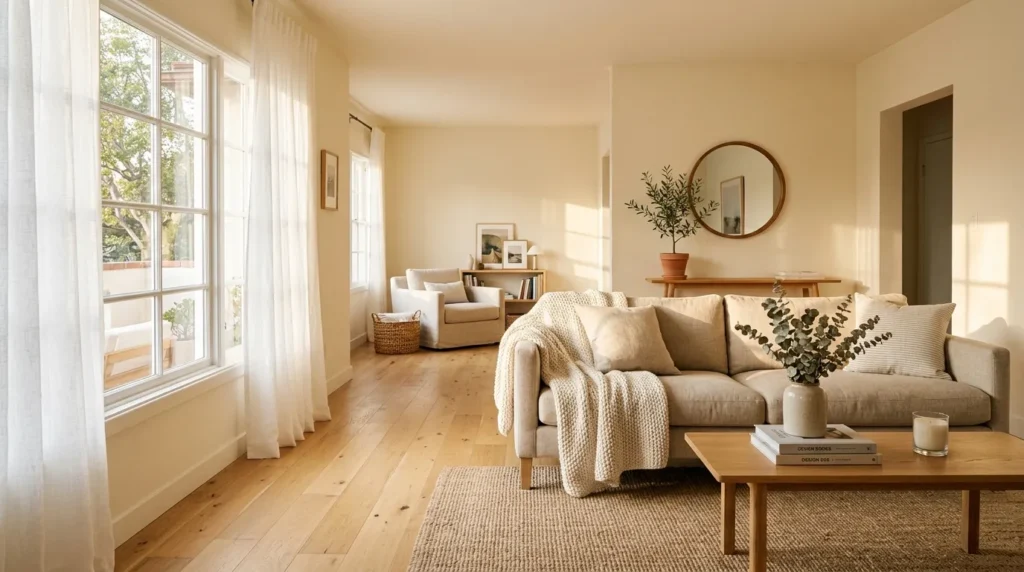
Why It Works Not all whites are created equal, and this is one of the most common mistakes I see in neutral living rooms. A stark, cool-toned white can make a space feel sterile, especially in rooms with limited natural light. Warm whites — think soft ivory, warm greige, or off-white with a hint of yellow or beige undertone — read as inviting rather than clinical. I’ve noticed that homeowners who switch from a builder-grade white to a warmer shade often say the room instantly feels more “finished,” even before adding a single piece of furniture. The undertone does more visual work than most people expect.
How To Style It Test paint swatches on your actual walls at different times of day before committing, since lighting changes everything. Popular warm white choices include shades with cream or beige undertones rather than blue or gray ones. Pair warm white walls with natural wood furniture, woven baskets, and linen textiles to reinforce the warmth. If your room gets limited natural light, lean slightly warmer to avoid a gray, flat appearance by evening.
2. Layered Neutral Textures
Quick Benefits
- Prevents the room from feeling flat or one-dimensional
- Adds visual interest without introducing bold color
- Makes the space feel more expensive and intentional
- Works well for renters who can’t paint or renovate
- Easy to adjust seasonally without a full redesign
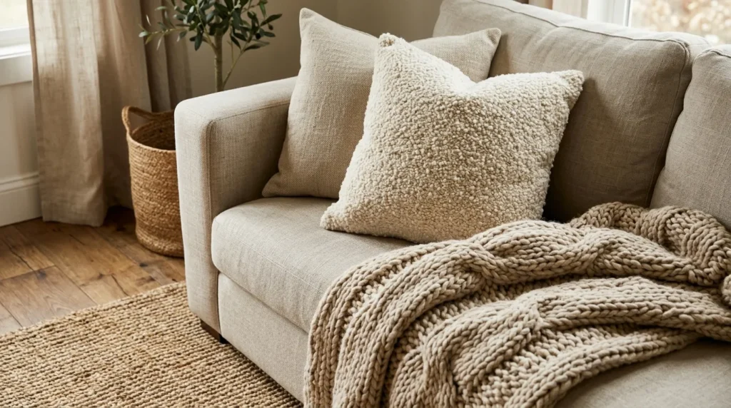
Why It Works A neutral living room lives or dies by its texture. Without it, an all-beige or all-gray room can feel unfinished no matter how nice the furniture is. That’s why many designers recommend building a room with at least three to four different textures before adding any color at all — think smooth linen, nubby boucle, woven jute, and matte ceramic. Texture is what your eye reads as “layered” and “designed” rather than “matchy.” One simple trick I always suggest is closing your eyes and touching each surface in the room; if everything feels the same, the room will look flat too.
How To Style It Combine a smooth linen sofa with a chunky knit throw, a jute or wool rug, and at least one woven basket or textured vase. Mix matte and slightly glossy finishes on hard surfaces like coffee tables and lighting. Layer rugs when possible — a natural fiber rug topped with a smaller patterned or textured accent rug adds dimension underfoot. Rotate textures seasonally, swapping linen for wool and boucle in colder months.
3. Natural Wood Tones
Quick Benefits
- Grounds the room and prevents it from feeling washed out
- Adds warmth without introducing additional color
- Creates a timeless look that won’t feel dated
- Works across farmhouse, modern, and traditional styles
- Balances cooler neutrals like gray and white
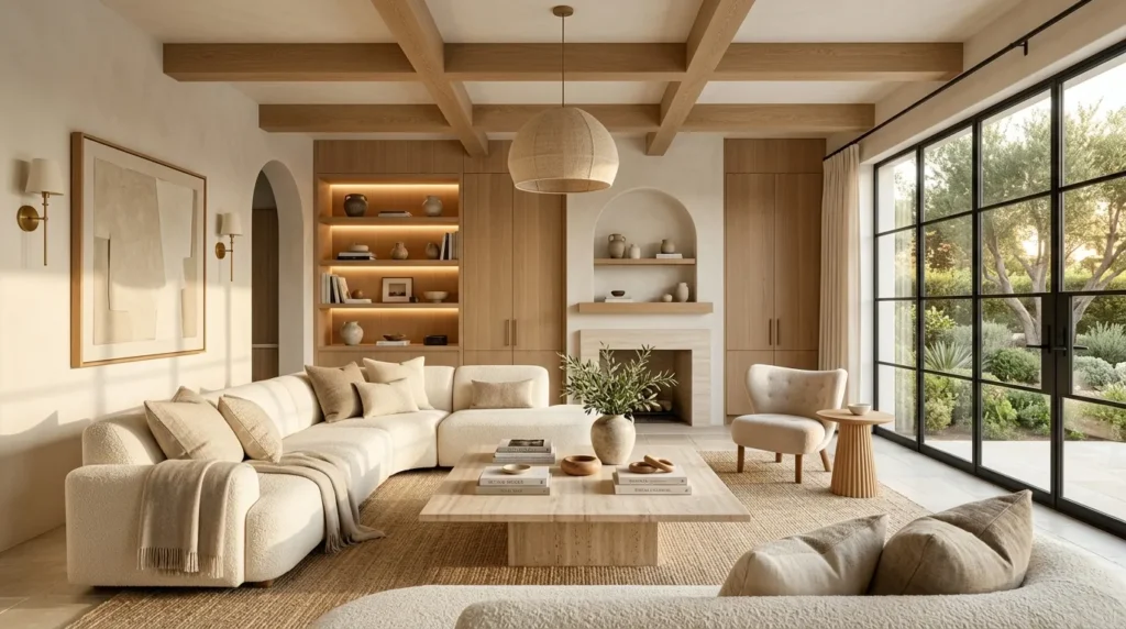
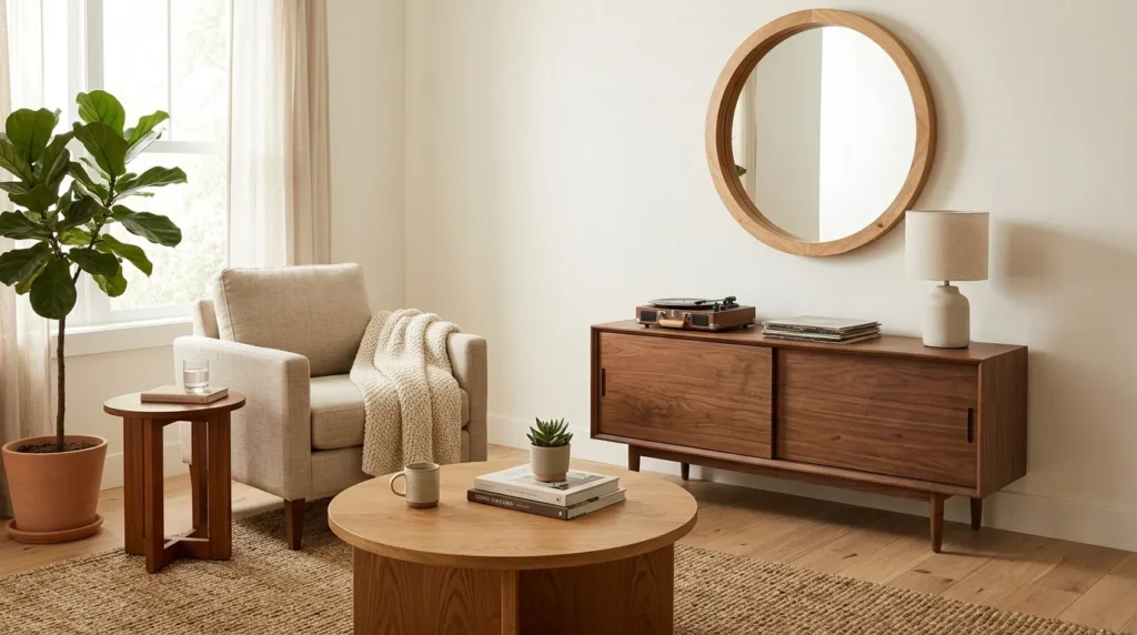
Why It Works A neutral living room without any wood tends to feel a little cold, no matter how well the palette is chosen. Wood introduces natural variation, grain, and warmth that painted or upholstered pieces simply can’t replicate. I’ve seen this idea transform spaces that felt sterile into rooms that feel collected and lived-in almost overnight. Mixing wood tones intentionally — rather than matching every piece exactly — actually reads as more sophisticated and less like a matching furniture set from a single catalog page.
How To Style It Choose one dominant wood tone for larger pieces like a coffee table or media console, then allow smaller pieces like picture frames or side tables to vary slightly. Stick within the same general warmth range (all warm-toned or all cool-toned) to avoid clashing. Consider a wood floor, exposed beam, or wood-framed mirror if your existing furniture is mostly upholstered. Vintage or secondhand wood pieces often bring in the kind of natural patina that new furniture can’t replicate.
4. Soft Linen Upholstery
Quick Benefits
- Adds subtle texture that photographs beautifully
- Feels relaxed and comfortable rather than formal
- Ages gracefully compared to synthetic fabrics
- Works well with slipcovers for easy cleaning
- Complements nearly every neutral color scheme
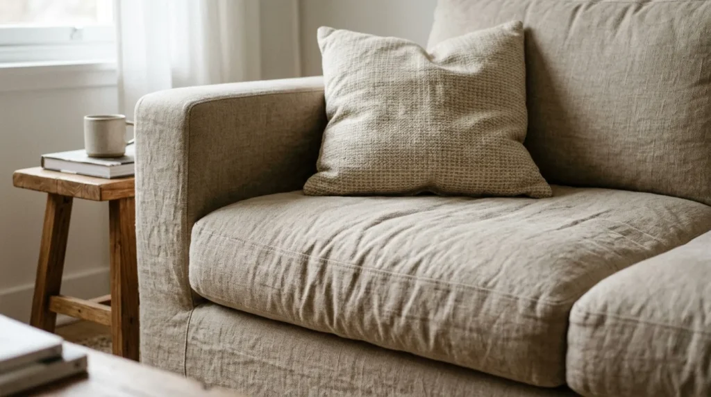
Why It Works Linen has become a staple in neutral living rooms for good reason. Its natural slub texture catches light differently than smooth fabrics, which adds visual depth without requiring any additional color or pattern. It also has a relaxed, slightly wrinkled quality that keeps a neutral room from feeling too formal or showroom-perfect. In my experience, rooms with linen upholstery tend to feel more “lived-in” in the best possible way — comfortable enough for a Sunday afternoon, but still polished.
How To Style It Look for linen or linen-blend sofas and armchairs in soft oatmeal, warm white, or light greige tones. If a full linen sofa isn’t in the budget, a linen slipcover over an existing piece achieves a similar effect. Pair linen upholstery with contrasting textures like leather, wood, or wool to keep the room from feeling too soft or one-note. Keep in mind linen wrinkles are part of its charm, not a flaw to fight against.
5. Woven Textural Accents
Quick Benefits
- Adds handmade, organic character to the space
- Introduces subtle pattern without using color
- Brings in natural materials like rattan and jute
- Inexpensive way to update a room seasonally
- Works in small doses or as a design theme
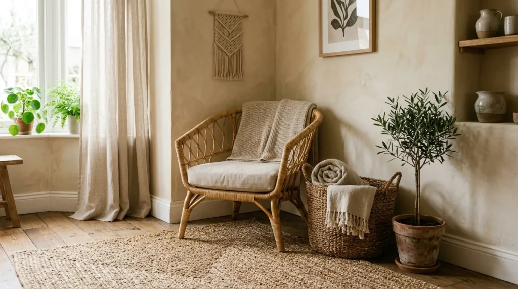
Why It Works Woven elements — rattan, seagrass, jute, wicker — bring an organic, handmade quality that manufactured decor often lacks. A mistake many homeowners make is filling a neutral room entirely with smooth, machine-made surfaces, which can end up feeling generic. Woven accents break that up and introduce a sense of craftsmanship, even when the pieces themselves are affordable. They also tend to photograph exceptionally well for Pinterest and social sharing, since the texture reads clearly even in a still image.
How To Style It Introduce woven baskets for storage, a rattan chair or pendant light, or a woven wall hanging as a focal point. Layer a jute or sisal rug as a base layer under furniture for grounding texture. Small touches — a woven tray on the coffee table, a seagrass planter — add character without committing to a full redesign. Keep the rest of the palette simple so the woven textures stand out rather than competing with pattern or color.
6. Balanced Beige Palette
Quick Benefits
- Creates cohesion across furniture, walls, and decor
- Avoids the “too cold” or “too yellow” extremes
- Flexible enough to update with seasonal accents
- Flatters most lighting conditions and room sizes
- Timeless alternative to trend-driven color schemes
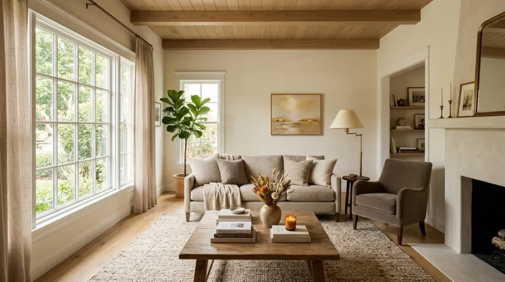
Why It Works Beige gets an undeserved reputation as boring, but a well-balanced beige palette is one of the most durable design choices available. The key is balancing warm and cool undertones so the room doesn’t skew too yellow (which can feel dated) or too gray (which can feel cold). That’s why many designers recommend building a palette with at least two or three beige tones of varying depth, rather than relying on a single shade throughout the entire room.
How To Style It Choose a mid-tone beige for larger pieces like sofas or rugs, a lighter shade for walls, and a deeper taupe or greige for accent pieces like pillows or a side chair. Test how your beige tones look next to natural light and artificial light, since beige can shift dramatically under different bulbs. Add a warm metal finish like brass or bronze to keep the palette from feeling flat, and avoid pairing beige with cool blue-grays unless you want a deliberate contrast.
7. Matte Black Contrast
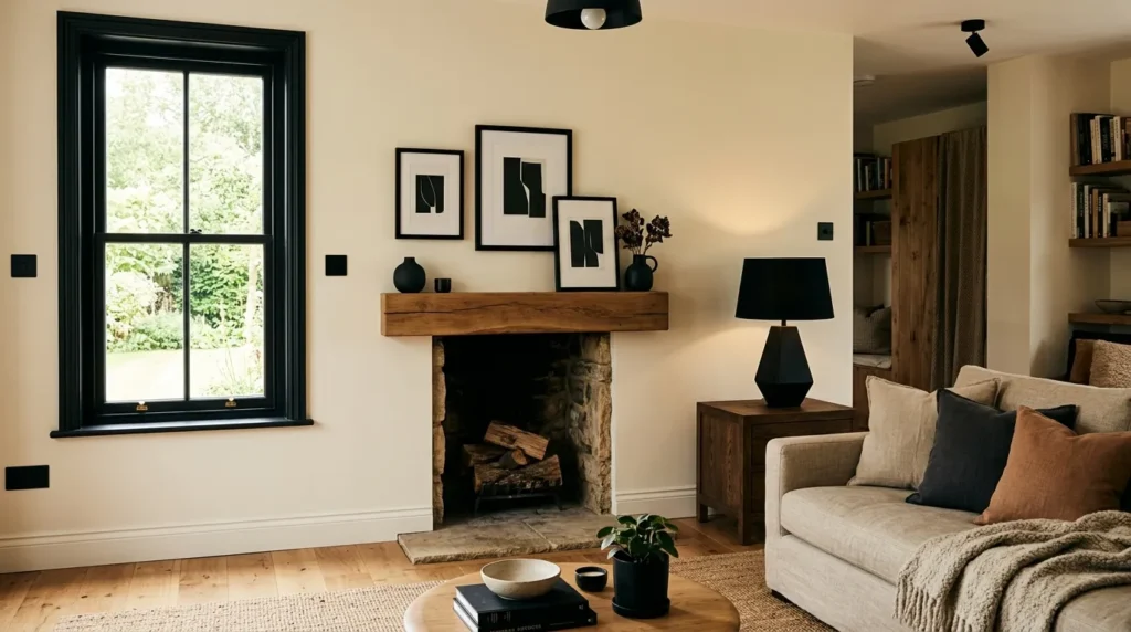
Quick Benefits
- Sharpens and defines an otherwise soft palette
- Prevents the room from feeling washed out
- Draws the eye and creates a focal point
- Pairs well with brass, wood, and linen
- Small doses go a long way
Why It Works A common issue with all-neutral rooms is that everything blends together and nothing stands out. A touch of matte black solves this instantly. It acts as a visual anchor, giving the eye somewhere to land and adding definition to an otherwise soft, tonal room. One simple trick I always suggest is adding black in small, deliberate doses — window frames, light fixtures, picture frames — rather than a large piece of black furniture that can overwhelm a neutral space.
How To Style It Start small with black picture frames, a black table lamp base, or matte black hardware on furniture. A black-framed mirror or window can add architectural interest without heaviness. If you’re ready for a larger commitment, a black coffee table or accent chair works well as a single grounding piece. Keep black contrast to two or three spots in the room maximum so it reads as intentional rather than scattered.
8. Organic Stone Elements
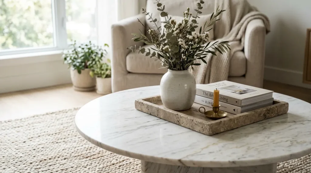
Quick Benefits
- Adds natural, timeless material variation
- Introduces subtle color and veining without pattern
- Elevates the perceived quality of a room
- Works well on tabletops, decor, and accents
- Pairs beautifully with wood and linen
Why It Works Stone — whether marble, travertine, or limestone — brings a level of natural variation that manufactured materials can’t fake. Even in small doses, stone elements add a sense of quality and permanence to a neutral room. I’ve noticed that a single stone piece, like a coffee table or a set of coasters, can make an entire room feel more considered, simply because of how the material catches light and shows subtle natural veining.
How To Style It A stone coffee table or side table works as a strong focal point without introducing color. Smaller touches like a marble tray, stone bookends, or a travertine lamp base add the same effect on a smaller budget. Pair stone with warm wood tones to keep the room from feeling too cold or gallery-like. If budget is a concern, faux stone or stone-look laminate options have improved significantly and can achieve a similar visual effect.
9. Cozy Wool Throws
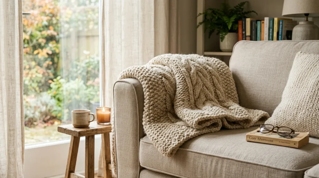
Quick Benefits
- Adds instant warmth and coziness to any neutral room
- Introduces texture that’s easy to update seasonally
- Inexpensive way to layer a sofa or chair
- Works in warm and cool neutral palettes alike
- Provides functional comfort, not just decoration
Why It Works Comfort matters as much as style in a living room, and wool throws deliver both. A chunky knit or woven wool throw adds immediate texture and warmth to a sofa or armchair, breaking up smooth upholstery and making the space feel more inviting. If you’re anything like me, you probably gravitate toward the corner of the couch with the throw blanket first — and that instinct is exactly why this detail matters so much in a lived-in neutral room.
How To Style It Drape a throw casually over one arm of the sofa or folded across the back of a chair rather than perfectly centered, which can look staged. Choose a wool or wool-blend throw in a slightly different shade than your sofa to create subtle contrast. Rotate throws seasonally — lighter cotton or linen blends in warmer months, chunky wool in colder ones — to keep the room feeling current without a full redesign.
10. Airy Curtain Styling
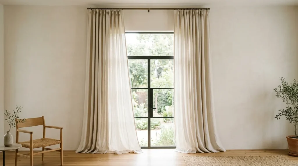
Quick Benefits
- Softens natural light without darkening the room
- Adds height and makes ceilings feel taller
- Frames windows for a more finished look
- Works well with both minimal and layered decor styles
- Inexpensive update with a noticeable visual impact
Why It Works Curtains are one of the most overlooked details in a neutral living room, and they can make a bigger difference than most people expect. Lightweight, airy fabrics like linen or sheer cotton soften harsh light and add a gentle sense of movement to the room. A mistake many homeowners make is hanging curtains too low or too close to the window frame, which visually shrinks the space. Properly hung curtains, by contrast, can make ceilings feel taller and windows feel larger.
How To Style It Hang curtain rods as close to the ceiling as possible, ideally a few inches above the window frame, and extend them several inches beyond the window on each side. Choose lightweight linen or cotton in a neutral tone that complements your wall color without matching it exactly. Let curtains puddle slightly at the floor or hang just above it for a relaxed, finished look. Avoid heavy, dark drapery unless you’re intentionally creating a dramatic contrast point.
Frequently Asked Questions
What colors count as neutral for a living room? Neutrals typically include white, beige, gray, greige, taupe, cream, and soft browns. The key is choosing tones without strong undertones of blue, green, or red, though warm and cool neutrals can be mixed intentionally for balance and depth.
How do I keep a neutral living room from feeling boring? Layer multiple textures, mix wood tones, and add at least one contrasting element like matte black or stone. A truly neutral room relies on texture and material variation rather than color to create visual interest.
Is a neutral living room a good choice for resale value? Yes, neutral palettes are generally considered a safer choice for resale since they appeal to a wider range of buyers and allow prospective owners to picture their own furniture and style in the space more easily.
Can a neutral living room work in a small space? Neutral palettes often work especially well in small rooms because lighter tones reflect more light and can make a space feel larger and more open compared to darker, saturated colors.
How many different neutral tones should I use in one room? A good starting point is three to five varying tones and textures — for example, a warm white wall, a beige sofa, a taupe rug, and natural wood accents — to avoid a flat, one-note appearance.
Do neutral living rooms require a pop of color? Not necessarily. A well-balanced neutral room can feel complete without added color, as long as there’s enough contrast in texture, material, and tone. A small color accent is optional, not required.
What’s the easiest way to update a neutral living room for renters? Focus on textiles and accessories that don’t require permanent changes — throw pillows, rugs, curtains, and woven baskets are all easy ways to layer texture and warmth without painting or renovating.
Final Thoughts
A neutral living room only feels flat when it’s treated as a single color rather than a full palette of tones, textures, and materials. The ten ideas above — from warm white walls to airy curtain styling — work because they focus on depth and contrast rather than relying on color to do all the visual work. That’s ultimately what makes a neutral space feel timeless instead of forgettable.
You don’t need to tackle all ten ideas at once, and you don’t need a full renovation budget to see a difference. Start with one or two ideas and gradually build a space that reflects your style and supports everyday comfort. A new throw blanket, a warmer white paint swatch, or a few woven baskets can shift the entire feel of a room without a major investment.
The rooms that stay beautiful for years, not just for a season, are the ones built on these fundamentals rather than trends. Pick the idea that feels most doable this week, and let the rest come together over time.
Related Articles
- Cozy Bedroom Ideas for Every Season
- Small Living Room Layout Ideas That Actually Work
- Modern Farmhouse Decor on a Budget
- How to Layer Rugs Like a Designer
- DIY Accent Wall Ideas for Renters