10 Two-Tone Kitchen Cabinet Ideas That Add Character
Introduction
A single-color kitchen can feel safe, but it can also feel a little flat, especially in a room where cabinetry takes up so much visual space. A mistake many homeowners make is assuming that mixing cabinet colors will look chaotic or mismatched, when in reality, a well-planned two-tone kitchen is one of the most effective ways to add depth, dimension, and personality without sacrificing a cohesive, put-together look.
In my experience, two-tone kitchens work because they give the eye something to follow — a lower cabinet color that grounds the room, paired with a lighter upper cabinet or a contrasting island that draws attention to a specific zone. This isn’t about combining random colors for the sake of variety; it’s a deliberate design strategy that professional kitchen designers have relied on for years to create visual interest in a room that could otherwise feel monotone.
This guide walks through ten specific two-tone cabinet combinations and layout strategies, along with the practical reasoning and styling advice behind each one. Whether you’re planning a full renovation or considering repainting an island as a smaller update, each idea includes real guidance for pulling it off successfully.
If you’re anything like me, you’ve probably scrolled past dozens of gorgeous two-tone kitchens without a clear sense of how to choose the right combination for your own space. These ten ideas are meant to close that gap.
Table of Contents
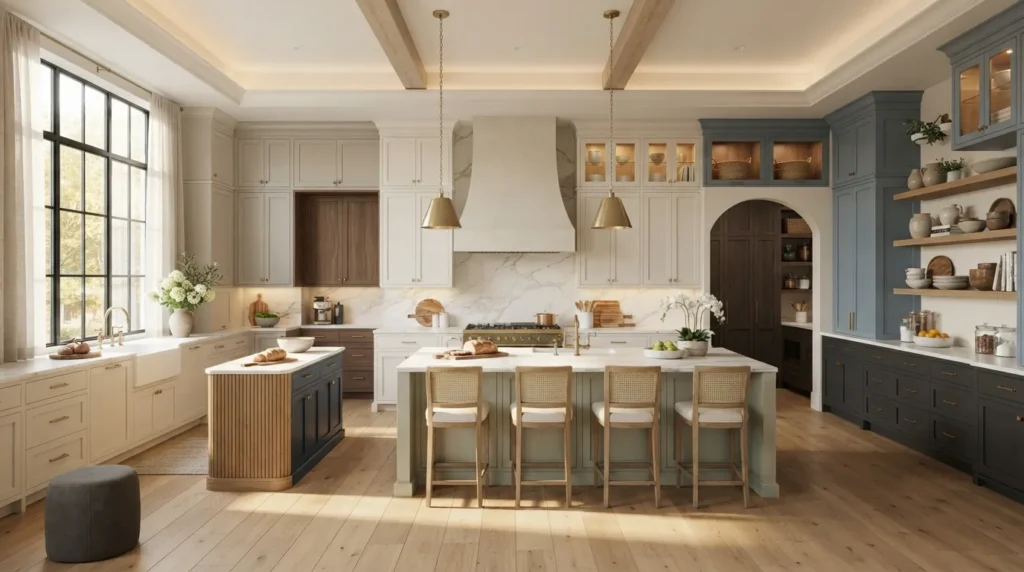
- Island Contrast Color — Making the island the room’s focal point.
- Upper Lower Split — Balancing light and dark across cabinet levels.
- Bold Navy And White — Pairing a rich, classic color with crisp white.
- Warm Wood And White — Combining natural texture with bright cabinetry.
- Black Accent Cabinets — Adding drama through a strategic dark tone.
- Green And Natural Wood — Blending an earthy color with organic warmth.
- Pantry Wall Contrast — Highlighting a specific storage zone.
- Two-Tone Hardware Pairing — Coordinating finishes across mixed colors.
- Open Shelf Color Break — Using shelving to transition between tones.
- Soft Sage And Cream — Creating a gentle, cottage-inspired contrast.
1. Island Contrast Color
Quick Benefits
- Creates an immediate focal point in the kitchen
- Allows for a bolder color choice without full commitment
- Balances a neutral perimeter with a statement piece
- Easy to update if the island is repainted later
- Works in nearly any kitchen layout
Why It Works
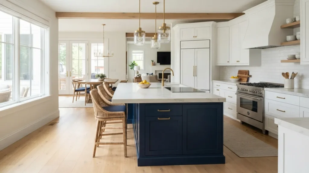
The kitchen island is often the most visually prominent piece of cabinetry in the room, which makes it the natural place to introduce a contrasting color. A mistake many homeowners make is painting the entire kitchen the same color as the island, missing the opportunity to let the island stand out as its own design moment. One thing that works especially well is choosing a deeper or bolder tone for the island specifically, since it reads as intentional rather than accidental, and it’s a far less permanent commitment than repainting every cabinet in the room.
How To Style It
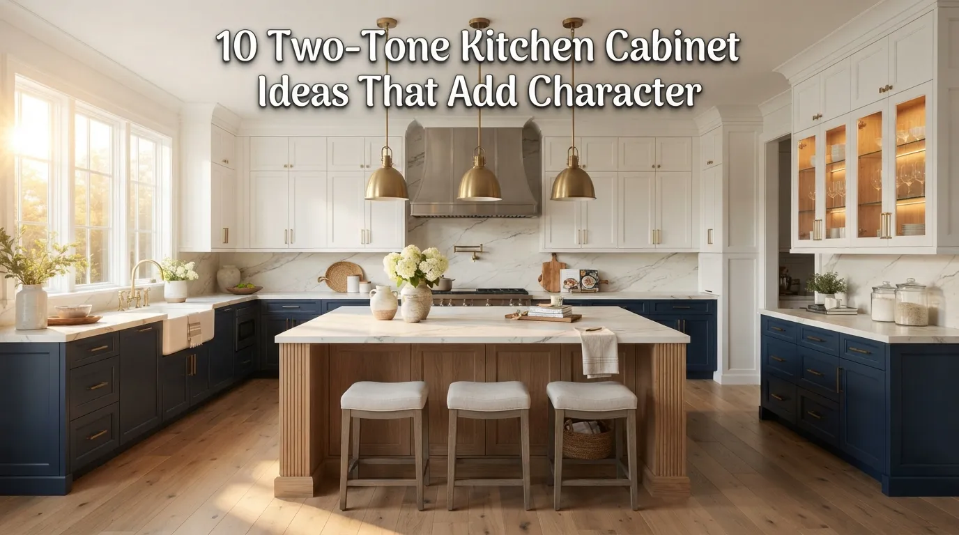
Choose a color for the island that has enough contrast with the surrounding cabinetry to feel deliberate, whether that’s a deep navy against white perimeter cabinets or a warm wood tone against a painted finish. Keep the countertop material consistent across the island and perimeter to maintain cohesion despite the color contrast. Pair the island’s contrasting color with hardware or a pendant light finish that ties back to the rest of the kitchen, reinforcing that the two tones belong to the same overall design.
2. Upper Lower Split
Quick Benefits
- Creates visual balance between light and dark
- Makes upper cabinets feel less heavy
- Grounds the room with a deeper lower tone
- Works well in both small and large kitchens
- Provides a classic, widely used two-tone layout
Why It Works
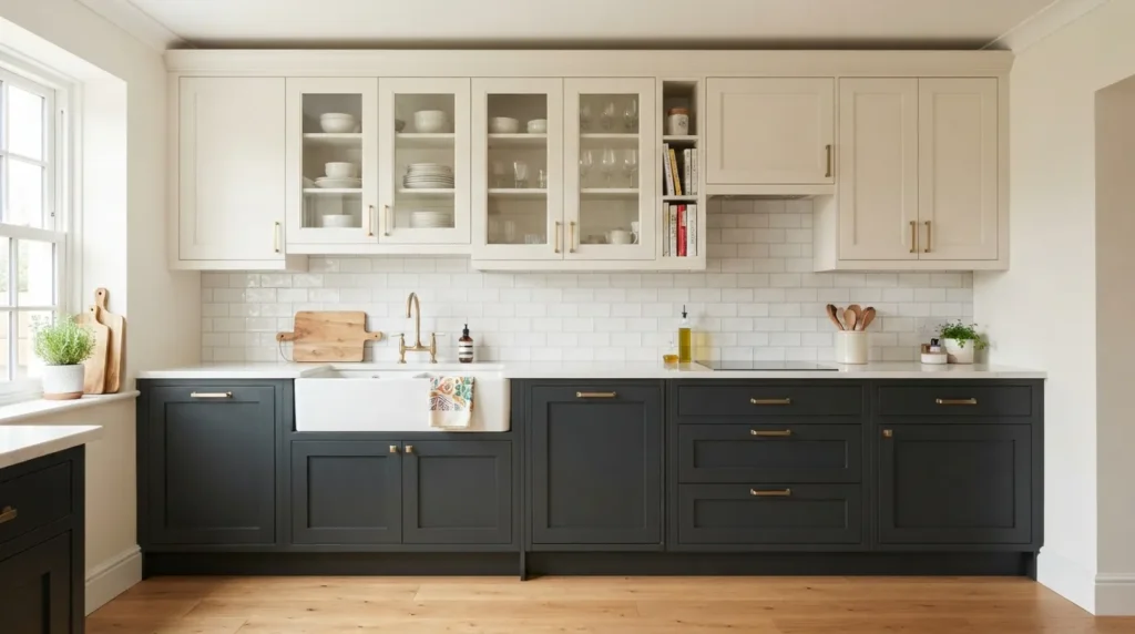
Splitting cabinet color by height — lighter upper cabinets paired with deeper, richer lower cabinets — is one of the most common and reliably successful two-tone layouts, since it mimics a natural sense of visual weight distribution, similar to how a room with a darker floor and lighter ceiling tends to feel balanced. I’ve noticed that this split also helps upper cabinets feel less heavy and enclosing, since the lighter color reflects more light near eye level and above, while the deeper lower cabinets ground the room.
How To Style It
Choose a lighter shade, such as white or a soft cream, for upper cabinets, and a deeper, richer tone, like navy, charcoal, or a deep green, for the lower cabinets and island. Keep the backsplash tile in a lighter, more neutral tone so it doesn’t compete with either cabinet color, allowing the eye to transition smoothly between the two levels. This layout works particularly well in kitchens with limited natural light, since the lighter upper cabinets help maintain a bright, open feel near the ceiling.
3. Bold Navy And White
Quick Benefits
- Provides strong, classic contrast
- Reads as sophisticated rather than trendy
- Pairs beautifully with brass or gold hardware
- Works in both traditional and modern kitchens
- Has remained popular across multiple design eras
Why It Works
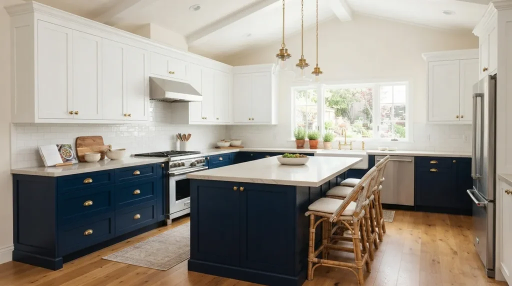
Navy and white is one of the most enduringly popular two-tone combinations because navy offers the drama and richness of a dark color without the starkness of true black. That’s why many designers recommend navy specifically for homeowners who want a bold two-tone look but are hesitant to commit to something as intense as black cabinetry. The deep blue tone photographs beautifully and pairs exceptionally well with warm metal hardware, which helps soften the contrast even further.
How To Style It
Use navy for the lower cabinets and island, pairing it with crisp white upper cabinets and a light natural stone or quartz countertop to keep the overall palette from feeling too heavy. Brass or unlacquered gold hardware tends to complement navy particularly well, adding warmth that balances the coolness of the blue tone. A white subway tile backsplash keeps the transition between the two cabinet colors clean and uncluttered.
4. Warm Wood And White
Quick Benefits
- Adds natural texture alongside crisp white
- Creates an organic, grounded contrast
- Works well in farmhouse and modern kitchens alike
- Softens the starkness of all-white cabinetry
- Pairs beautifully with natural stone countertops
Why It Works
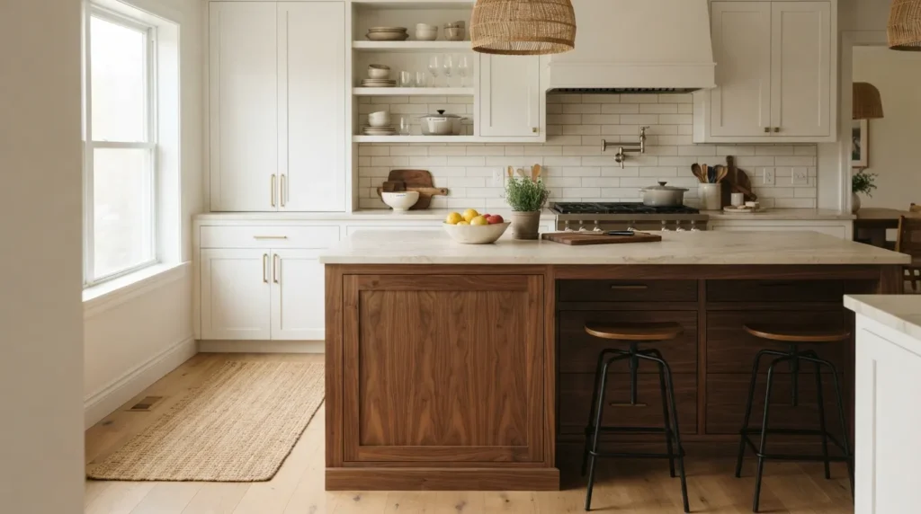
Pairing warm wood-toned cabinetry with white is a two-tone approach that leans more organic than the bold color pairings elsewhere on this list, since it introduces contrast through material and texture rather than through two painted colors. A mistake many homeowners make is choosing an all-white kitchen and missing the opportunity to add warmth through a natural wood element, which can make an all-white space feel a bit sterile. Wood tones bring in the kind of natural variation that painted surfaces alone can’t achieve.
How To Style It
Choose a warm wood tone, such as white oak or walnut, for the island or lower cabinets, and pair it with white or cream upper cabinets and perimeter cabinetry. Natural stone countertops with warm undertones help bridge the two materials, since they echo both the white cabinetry and the warmth of the wood. This pairing works particularly well with brass or matte black hardware, both of which complement wood tones nicely.
5. Black Accent Cabinets
Quick Benefits
- Adds dramatic contrast and visual depth
- Creates a striking, memorable focal point
- Works especially well in smaller doses
- Pairs beautifully with brass and natural materials
- Elevates the kitchen’s overall sophistication
Why It Works
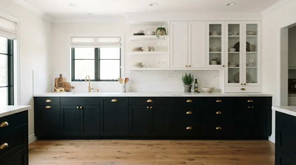
Black cabinetry, used strategically rather than throughout the entire kitchen, adds a level of drama and sophistication that a purely neutral kitchen often lacks. A mistake many homeowners make is either avoiding black entirely, fearing it will feel too heavy, or using it throughout the whole kitchen, which can make a smaller space feel closed-in. Used specifically on an island or a single wall of cabinetry, black creates a striking visual anchor without overwhelming the room.
How To Style It
Reserve black for a single, contained element, such as the island or a run of lower cabinets along one wall, while keeping the majority of the kitchen in a lighter, neutral tone. Pair black cabinetry with warm brass hardware and natural wood or stone accents to keep the look from feeling too cold or severe. Good lighting is especially important in kitchens with black cabinetry, since dark surfaces absorb rather than reflect light, so be sure the surrounding space has ample natural or layered artificial lighting.
6. Green And Natural Wood
Quick Benefits
- Creates an earthy, organic color pairing
- Works beautifully in farmhouse and cottage kitchens
- Adds a soft, nature-inspired focal point
- Pairs well with brass and matte black hardware
- Feels fresh without being overly trend-driven
Why It Works
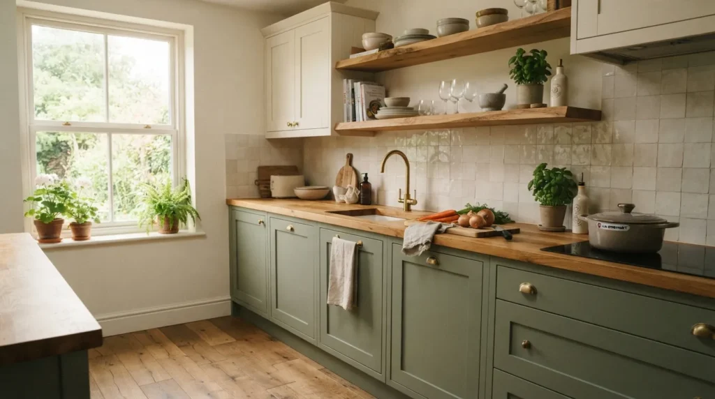
Deep or sage green paired with natural wood tones creates one of the most organic, nature-inspired two-tone combinations available, echoing the colors found in an actual forest or garden. I’ve seen this idea transform kitchens that otherwise felt a bit sterile or overly neutral, simply by introducing a green island or a set of green lower cabinets alongside warm wood open shelving or flooring. This pairing feels calming and grounded rather than jarring, even though green is a less traditional kitchen color choice.
How To Style It
Choose a muted, earthy green — sage, olive, or a deeper forest tone — rather than a bright or overly saturated shade, which can feel more trend-driven and less timeless. Pair the green cabinetry with warm wood open shelving, a butcher block countertop, or wood flooring to reinforce the earthy, organic pairing. Cream or white upper cabinets keep the overall palette balanced and prevent the green from feeling too dominant throughout the space.
7. Pantry Wall Contrast
Quick Benefits
- Highlights a functional storage area
- Adds visual interest to an often-overlooked wall
- Creates a clear zone distinction within an open kitchen
- Works well with glass-front or open pantry cabinetry
- Provides an easy way to introduce a bolder color
Why It Works
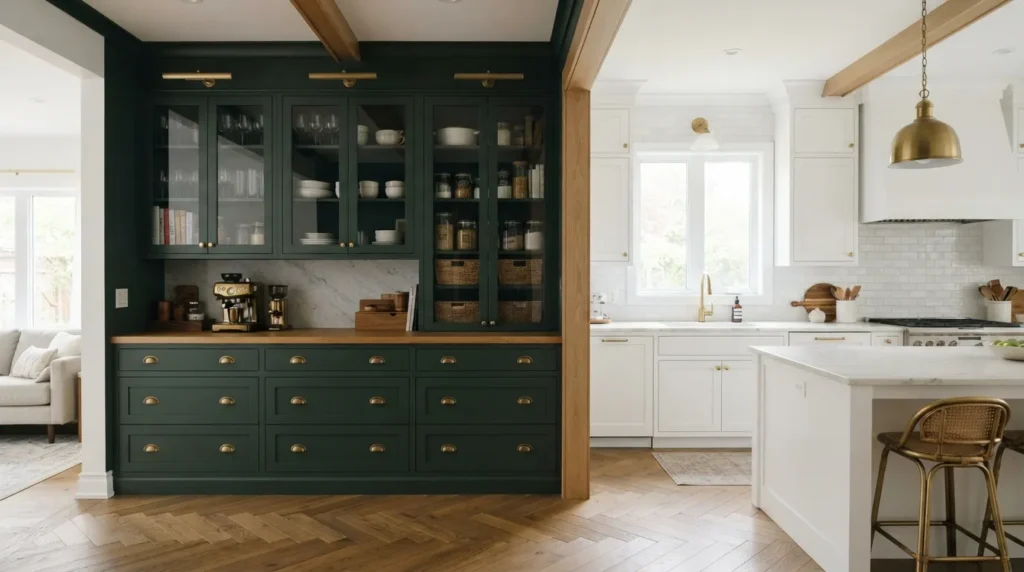
A pantry wall, especially in open-concept kitchens, is often treated as purely functional, but it also presents an excellent opportunity to introduce a contrasting color without affecting the primary cooking and prep areas. A mistake many homeowners make is painting the pantry wall the exact same color as the rest of the kitchen, missing a chance to add visual interest to a wall that’s already naturally distinct in function. A contrasting pantry wall creates a subtle zone distinction that reads as intentional rather than an afterthought.
How To Style It
Choose a deeper or bolder color for pantry cabinetry than the rest of the kitchen, particularly if the pantry is recessed into its own nook or wall, which naturally separates it from the main cooking area. Glass-front doors on a portion of the pantry cabinetry allow the contrasting color to be visible even when the doors are closed, adding to the visual interest. Keep the hardware finish consistent with the rest of the kitchen so the pantry wall still feels connected to the overall design.
8. Two-Tone Hardware Pairing
Quick Benefits
- Reinforces the two-tone cabinet color story
- Adds a layer of intentional, coordinated detail
- Works well across mixed cabinet colors
- Provides flexibility for personal style
- Elevates the kitchen’s overall sense of polish
Why It Works
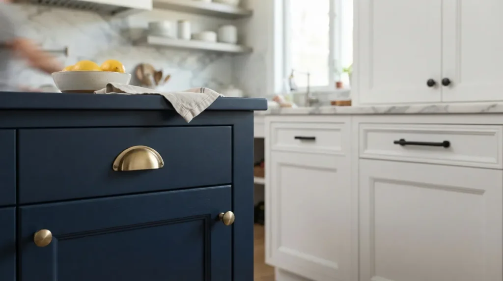
When cabinet colors are mixed, hardware finish becomes an important tool for either reinforcing or softening that contrast. One simple trick I always suggest is using two different but complementary hardware finishes across the two cabinet colors, such as brass on the island and matte black on the perimeter cabinets, which echoes the two-tone color story in a more subtle way. This detail is easy to overlook, but it consistently elevates a two-tone kitchen from good to genuinely well-designed.
How To Style It
Choose two hardware finishes that pair naturally together, such as brass and matte black or brushed nickel and brass, and assign one finish to each cabinet color throughout the kitchen. Keep the faucet and any visible plumbing fixtures in whichever finish appears more prominently, usually the finish used on the perimeter cabinets, to avoid introducing a third competing metal tone. This approach adds a layer of intentional detail that ties the two cabinet colors together as a cohesive design choice rather than two separate decisions.
9. Open Shelf Color Break
Quick Benefits
- Provides a natural visual transition between cabinet tones
- Adds texture and display opportunity
- Lightens the overall visual weight of the cabinetry
- Works well in kitchens with two contrasting wall colors
- Creates a functional, stylish focal point
Why It Works
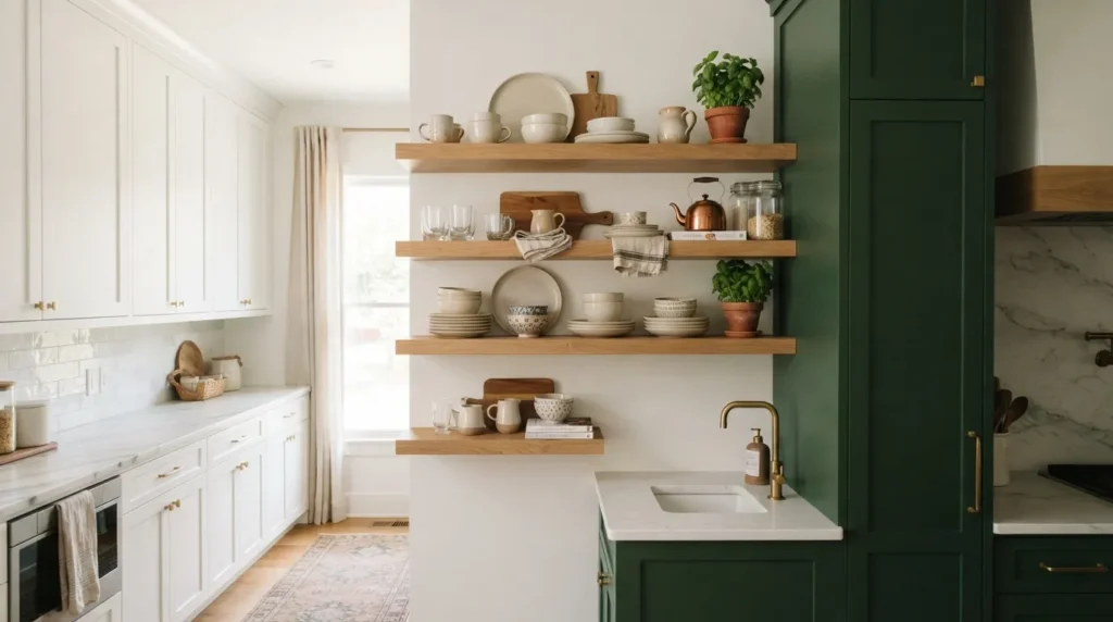
A section of open shelving placed between two contrasting cabinet colors serves as a natural visual break, softening what might otherwise feel like an abrupt transition between tones. A mistake many homeowners make is placing two contrasting cabinet colors directly adjacent to each other with no transitional element, which can feel more jarring than intentional. Open shelving bridges the gap, both literally and visually, while also adding useful display space for everyday dishware.
How To Style It
Install a section of open wood shelving at the point where two cabinet colors meet, such as between a white cabinet run and a contrasting colored pantry or island area. Style the shelves with a mix of dishware in colors that complement both cabinet tones, helping to visually connect the two color zones. Keep the shelving itself in a natural wood finish rather than a painted color, since wood serves as a neutral transitional material between the two more saturated tones.
10. Soft Sage And Cream
Quick Benefits
- Creates a gentle, cottage-inspired contrast
- Feels soft and calming rather than bold
- Works especially well in smaller kitchens
- Pairs beautifully with brass and warm wood accents
- Provides a subtle two-tone option for hesitant homeowners
Why It Works
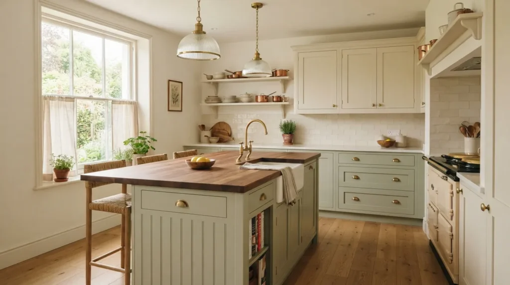
For homeowners who like the idea of a two-tone kitchen but are hesitant to commit to a bold, high-contrast pairing, soft sage green and cream offers a gentler alternative that still adds noticeable depth and character. A mistake many homeowners make is assuming two-tone always means high contrast, when in reality, a subtle, low-contrast pairing like sage and cream can be just as effective at adding visual interest, particularly in smaller kitchens where a bolder combination might feel overwhelming.
How To Style It
Use soft sage green for the lower cabinets or island, paired with a warm cream for the upper cabinets, keeping both tones muted rather than saturated for the softest, most cottage-inspired effect. A light wood countertop, such as butcher block, complements this palette particularly well, reinforcing the soft, organic feel. Brass hardware and simple glass pendant lighting round out the look without introducing any additional bold colors that might compete with the gentle cabinet contrast.
Frequently Asked Questions
Is a two-tone kitchen a passing trend, or is it here to stay?
Two-tone kitchens have appeared in various forms for decades, though the specific color pairings have shifted with broader design trends. Classic combinations like white and wood, or white and navy, have shown particular staying power and are less likely to feel dated than more unusual or highly saturated pairings.
What’s the easiest way to try a two-tone kitchen without a full renovation?
Painting just the island a contrasting color is one of the most affordable and lowest-commitment ways to introduce a two-tone look. It requires far less time and expense than repainting or replacing all of the kitchen’s cabinetry.
Should the darker color always go on the bottom cabinets?
Not always, but it’s the more common and generally safer approach, since darker tones lower in the room create a grounded, balanced feel. Placing a bold color on upper cabinets is possible but requires more careful planning to avoid making the kitchen feel visually top-heavy.
How many colors should a two-tone kitchen actually have?
Despite the name, most successful two-tone kitchens rely on two primary cabinet colors along with one or two neutral supporting elements, such as countertops and backsplash tile. Introducing more than two cabinet colors can start to feel busy rather than intentional.
Do two-tone kitchens work well in small spaces?
Yes, especially with softer, lower-contrast pairings like sage and cream, or when the contrast is limited to a small element like an island or a single accent wall of pantry cabinetry. Bold, high-contrast pairings can work in small kitchens too, but require more careful planning around lighting and layout.
What hardware works best with a two-tone kitchen?
A single consistent hardware finish across both cabinet colors is the safest, most cohesive choice, though two complementary finishes assigned to each cabinet color can add an extra layer of intentional detail for those comfortable mixing metals.
Can I do a two-tone kitchen with painted cabinets I already have?
Yes, repainting an existing island or a single wall of cabinetry is one of the most common ways homeowners introduce a two-tone look without replacing any cabinet boxes. This works especially well with cabinets already in good structural condition that simply need a color update.
Conclusion
A two-tone kitchen doesn’t require a dramatic, high-contrast color scheme to make an impact — sometimes the most successful pairings are the subtle ones, like sage and cream or warm wood against white. What matters most is intention: choosing colors that complement each other, deciding where the contrast will live in the room, and tying the whole look together with consistent hardware and countertop choices.
Start with one or two ideas from this list and gradually build a space that reflects your style and supports everyday comfort. Whether that means repainting your island in a bold navy, introducing a section of open shelving to bridge two cabinet tones, or simply swapping hardware finishes to reinforce an existing color split, these choices compound into a kitchen with genuine character. The best two-tone kitchens aren’t about following a trend exactly — they’re about finding the color pairing that feels most like you.
Related Articles
- Timeless Kitchen Ideas That Never Go Out Of Style
- Modern Farmhouse Decor Essentials
- Neutral Home Styling Ideas
- How To Choose Kitchen Cabinet Hardware
- Small Kitchen Layout Solutions